Gorgi Kosev

code, music, math

@spion

Thoughts on LLMs for programming

Tue Jun 17 2025

I thought it might be a good idea to record my current views on where LLMs currently are at when it comes to writing code.

Code completion

This is probably the least disruptive and most effective way to use LLMs for writing actual code. The speedup is excellent with most popular languages, but the noticeable drop-off in capability with niche languages continues to persist. My scripting language of choice lately is nushell and both Copilot and Cursor struggle with the syntax.

Staying in the flow can be a bit difficult sometimes, but for those of us used to LSPs it shouldn't be too bad. Cursor's keybinding implementation is a bit better at getting out of the way at moments when I'd like to ignore it compared to Copilot. Windsurf's neovim plugin is also quite good.

Asking questions and analyzing code

Chat models make exploring large codebases much easier. However, they seem to have limited ability to dive deep enough into dependency links in the code. At certain level of complexity they tend to give up and reach a conclusion prematurely. Typically I'll jump in and look where the model got to at that point, then nudge it to explore a bit further. After a few more iterations we usually get to the bottom of it.

Anecdotally, analysis seems to be more reliable for niche languages compared to code completion - there is less of a drop-off in quality.

Doing well documented common tasks

This is really excellent. Adding a documentation bundle to Cursor in particular works extremely well: The LLM will find the relevant documentation and be immediately able to suggest the correct change.

On the flip side, many of these cases can simply utilize a script instead, and its unclear how much you gain compared to, say, having a search box in your editor instead to find the relevant script in the docs. However, since in practice most documentation isn't very neatly organized, and automation can be somewhat spotty, I think this is a net win.

Writing new code in an existing codebase

This is where things can be hit or miss. If I let the model jump in straight into writing code, it will often make poor decisions - sometimes due to lacking context, other times because its biased towards action instead of thinking about the best approach.

What I've found extremely useful is Cline's plan / act separation. By default, the chat starts out in plan mode, where I go back-and-forth with the LLM outlining the task and figuring out exactly what needs to be done. Once we get to a good understanding, I switch to act mode and let the LLM write the code.

You can simulate this in Cursor too by using "ask" mode and then switching to "agent". Claude code recently added "plan" mode as well.

I've not experimented sufficiently with Cursor rules or CLAUDE.md memories. Should try those out.

Writing new code when you are not familiar with the technology

This is typically a bad idea. Instead, I tend to ask the LLM and then proceed to do something which I suspect many would find tedious: re-typing the code it provides. I know, it sounds like a waste of time, but it does wonders to help me take things in slowly. I always have the LSP on as well and pause to read the documentation as I go. I keep asking an endless amount of clarifying questions. I ask for documentation references (whenever possible) to ensure I dive deeper into the concepts and keep a healthy dose of skepticism in case of hallucinations.

Reasoning about complex bugs and behavior

Reasoning is hit-and-miss. In well-trodden areas (e.g. web development) they do really well. In other more niche areas (Rust code) there is some struggle. With technologies that have very little real-world training material (e.g. predicting terraform plan behaviour) its quite bad.

Hands-off automation

Surprisingly enough, LLMs also tend to fail here. Even when its possible to explain the exact steps to take, the error rate in some domains is too high to be able to do something reliably dozens to hundreds of times without supervision.

Other than the obvious (using temperature=0) I suspect that there are couple of interesting things that can be done here:

  • Providing a constrained set of tools specific to the problem at hand. The idea is to allow the user to maximize the percentage of the task that is fully deterministic and prevent it from doing something disastrous while unsupervised.
  • Providing a pen-and-paper equivalent tools (checklists, tables, etc). This should help the model keep track of the steps more reliably.

Unfortunately current cli tools have a few issues:

  • they seem to be geared more towards interactive use,
  • they have somewhat tedious way of defining new tools (MCP)
  • they tend to include very powerful tools by default (e.g. shell execution).

I'm working on an easy to use cli tool that solves this - llmcli.

If done right, I suspect this could be a huge multiplier in productivity. Right now most of the time using chat tools is spent on interactively micromanaging and checking on the LLM, which limits the maximum potential.

Things to explore

Updating documentation

Keeping documentation up-to-date is a common problem. In theory, LLMs should be able to help with this by helping finding relevant documentation and suggesting updates.

Updating dependencies

Another huge problem. LLMs could potentially help here a bit by analyzing the changed parts of the dependency and suggesting updates. In concert with tests this could work incredibly well.

Self-updating hierarchical memories.

LLMs should be able to learn from their interactions and continuously update their memories. Memories should follow a hierarchy, where the top-level memories are concepts found to generalize with the user across different projects and tasks, while the lower-level memories are more specific to the current project. The hierarchy could also extend over time, with weeks and months having their own memories and compaction process - possibly with bias towards recent memories.

Conclusion

While there's been a lot of progress, LLMs still leave a lot to be desired. I suspect that most of the incoming innovation will focus on managing memory and context. Repeatable reliability, as well as capabilities that are not covered well by the training data will likely continue to be a challenge. To address reliability, I suspect we'll compensate with more comprehensive documentation and tools that provide stronger guardrails for the LLMs. Out-of-distribution capabilities continue to be elusive and would likely require radical innovation.
COVID-19: Lockdowns work

Sat May 29 2021

Lockdowns work.

You may have heard that they don't.

Most studies that come to this conclusion make one or more of the following mistakes

Use of case counts instead of growth rate

Most studies that look whether NPIs work tend to look at absolute case numbers (adjusted for population size) and try to correlate them with NPIs like stringency measures.

The core error made in this case is that NPIs don't affect the case numbers directly. Instead, they affect RtR_t, or the rate of spread of the virus. If you think about it, it makes a lot of sense: a person with COVID staying at home doesn't affect the current number of cases. They are still sick. What they do affect is how many people they are going to infect. By minimizing the amount of time and number of people they spend in contact with, they minimize the chances of transmitting the virus.

Why is this important? Lets say the following happens:

  • A country starts with Rt=2R_t=2. Their cases are growing
  • They apply some interventions (lockdown). This gets them to Rt=1.5R_t = 1.5

Now if we look at cases vs rate of growth, we get the following:

  • The case graphs look about the same. Cases are still growing, so the measures applied "don't work"
  • If we look at the rate of growth, we'll actually see that they work, but they're not enough to reverse the exponential process from growing to shrinking (For that we need Rt<1R_t < 1).

So while looking at cases, we can't see whether measures are actually working until they're good enough to get Rt<1R_t < 1

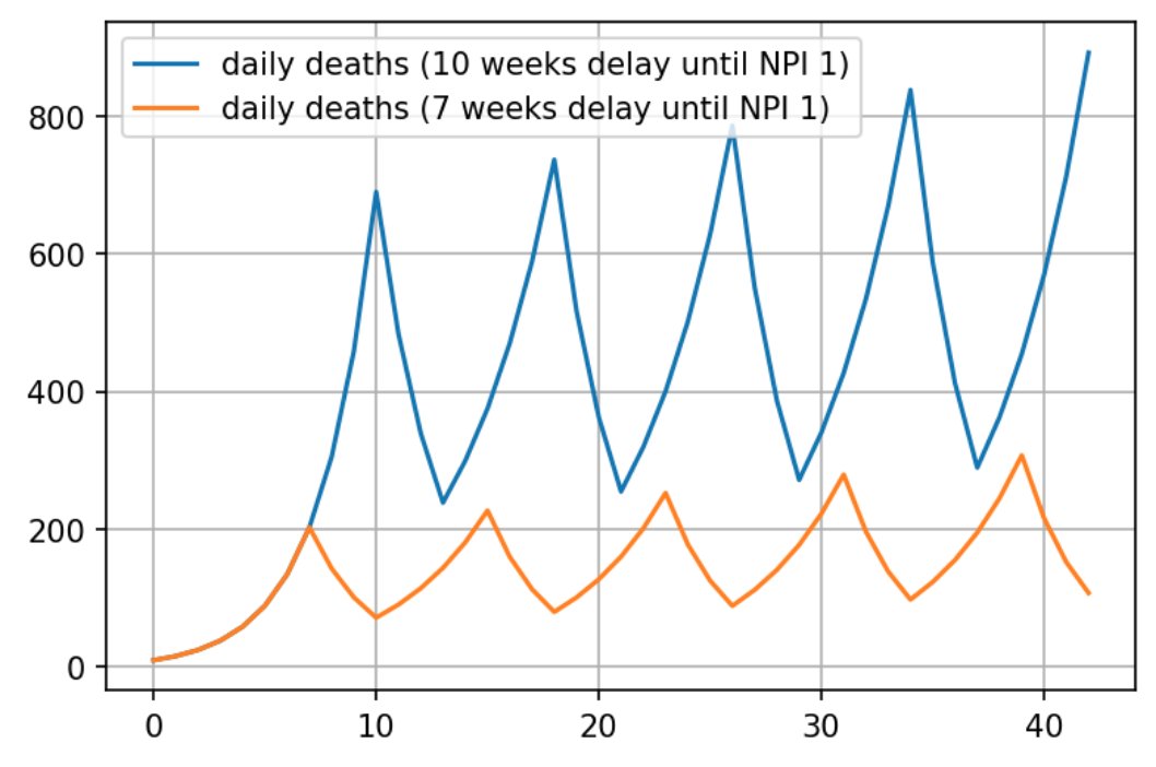
The situation is even worse if we look at case number totals. Then, the timing of the lockdowns also affects the outcome. A country that spends the same total amount of time in lockdowns but starts 3 weeks earlier could have vastly different outcomes than if they started later, because they let the "base" of the exponent accumulate:

img

Still, you might object - if that worked, we would still see a lot less virus in countries that have more stringent measures? The answer is no, but to figure out why, we need to get to the second problem, which is:

Comparing countries (multivariate problems as univariate)

As someone who has lived in 2 and visited (for an extended period of time) 3 countries in their life, we tend to underestimate just how different countries are, and how different the typical life of a person in those countries is. Variables include public transport vs cars, large supermarkets versus tiny shops, building ventilation codes, bar/pub ventilation codes, outdoors vs indoors venues, average household size, population density, climate and so on.

Comparing between countries is statistically futile. Its much better to compare the exact same place with itself before and after the introduction (or release) of NPIs (non-pharmaceutical interventions). That way, you can see what kind of difference that particular intervention makes, and you are no longer affected by any variables that are different across locations.

And we're down to the last problem, which is

Looking at stringency measures vs population behavior

A lot of studies measure various "stringency index" as the input variables. This is unfortunately also flawed. How effective a measure is will depend on a lot of things, including how much people believe in it. Convincing people that lockdowns don't work makes lockdowns less effective, for example. The fact that its Christmas or another religious holiday will also make people more likely to ignore decrees. Cultural factors could also be in play. Inability to stay at home due to lack of support from work might also play a role, and so on.

Its much better to measure real behavior. Google provides us with a variable called "percentage increase in stay at home time". The way they calculate this is by getting the baseline amount of time people spent at home daily around February 2020, then letting us know (for each country and each region) how much that time has increased or decreased relative to the baseline.

For example, if people in the UK stayed at home 14h/day at home on average in February 2020, and they now spend 20h/day at home, that is around 40% increase relative to the baseline.

This measure is not perfect. For one, outdoor activities are much safer than indoor ones but not counted as staying at home. For another, people in a country that have the habit of visiting each other a lot would completely skew the results. But its far less flawed than the stringency index.

Combining all corrections

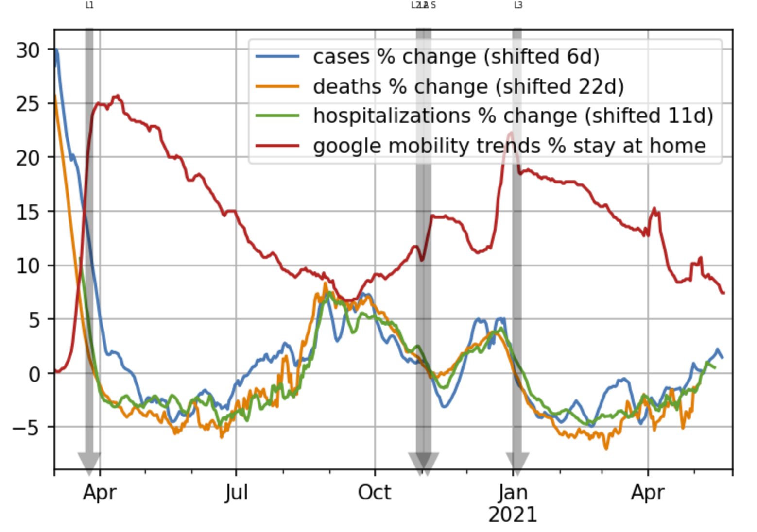
If we combine all corrections, we get the following result for the UK.

end result

Rate of growth (percentage change) of cases, hospitalizations and deaths is almost perfectly inversely proportional to the increase of time spent at home

Stats for more countries available at this link - you can see that people in Sweden, for example, did increase the amount of time they spend at home substantially

Stats for USA states available at this link

Absolute risk reduction and COVID vaccines

Sun May 16 2021

The latest bit of misinformation on COVID is about absolute risk reduction of COVID vaccines. For example, Peter Attia posted a video on this topic a couple of weeks ago, stating that ARR is about 1% as measured by the trials, which is completely misleading:

ARR and number needed to treat are a staple for doctors. So why is it not applicable to these COVID vaccine trials?

To understand why, lets first briefly review how the COVID vaccine trials work.

In the COVID vaccine trial, people are randomly chosen to be placed into two groups: a control group and a treatment group. The treatment group is given the actual vaccine, whereas the control group is given some placebo (saline water or an unrelated vaccine).

Importantly, in the next step participants are told to observe all precautions that non-vaccinated people are advised to observe: to mask, to socially distance and in general to avoid situations where they may be exposed to the virus.

During this time, the prevalence of the virus is controlled by other means: distancing, stay at home orders, masks, periodic rapid antigen tests and any other tools at our disposal.

Despite precautions, a percentage of participants will be unfortunate enough to be exposed to someone infectious. When that happens, a further sub-percentage of them in both groups will become infected, and symptomatic.

The trials for Pfizer and Moderna were designed to stop at a fixed number of infections. Moderna had 30,000 participants, with 15,000 in the control and intervention group each. Pfizer had around

We can measure the relative risk reduction by comparing the number of symptomatic infected in the control group and in the intervention group. For example, if we had 100 people infected in the control group but only 10 in the intervention, the relative risk reduction of that vaccine would be 90%

But what about absolute risk reduction?

We can't measure that.

"Why not?" you might wonder. If we have the size of the control group - e.g. 10 000 people, and the size of the intervention group (e.g. also 10 000 people), shouldn't the absolute risk be really easy to calculate? i.e.

ARR=10010000110000=0.9ARR = { 100 \over 10 000 } - { 1 \over 10000 } = 0.9%

The answer is no, and here is why.

In medication experiments where we measure ARR / NNT, the medications are given to a population with relatively stable characteristics. The percentage of people who are at risk to develop sickness does not change all that much.

In contrast, in the COVID vaccine experiments, only a small percentage of the population is exposed to infectious virus because we're using other (very expensive) means to control the rate of growth. The typical prevalence while we run these experiments is less than 2%. For example, see the ONS survey data in England for January 2021 which measured 2% prevalence in England at the worst possible period of the pandemic.

How many people in the control and intervention group were exposed to COVID? We don't know, but its not likely to be much higher than 1-3%, depending on the community prevalence of the disease at the time the experiment was done. To really measure absolute risk reduction, we would have to ensure that we develop conditions for our trial groups that are similar to those when the restrictions are completely lifted. What would that mean? If restrictions are lifted, within a few months, perhaps a year, at least 80-90% of people would eventually be exposed to the virus. That is 30 times as many as during a typical COVID vaccine trial! (Numbers are illustrative, but an order of magnitude difference is almost certain)

So how do we achieve that in the experiment? Everyone in both the control and the intervention group would need to be acting without any precaution to get "naturally" exposed to COVID. Furthermore, everyone they're in contact with should also act without precautions to ensure there is a realistic probability that they're an infectious contact. Alternatively, the groups would deliberately need to expose themselves to the virus. Since its completely unethical to run an experiment like that, its not possible to recreate realistic conditions for the disease. Therefore, its not possible to measure ARR in the same way that its measured for medications.

The best we can do is try to extrapolate what that number would be. We know around 50%-60% are susceptible to developing symptomatic infection. If our absolute risk reduction measured when there was 1.5% prevalence was 1%, then the absolute risk reduction of developing symptomatic infection would probably be something closer to 35%

We don't know the exact ARR of COVID vaccines. But we know that its a lot closer to RRR, and nowhere near to the "ARR" number we can extrapolate from vaccine trials - that number is completely meaningless and depends heavily on the prevalence of the virus at the time of the trial.

COVID-19: Case counts don't matter. Growth does

Thu Sep 10 2020

The growth of cases is another hot and controversial COVID-19 topic. On one hand, the number of daily is getting to be very large in many European countries. On the other, it doesn't look like this rise in cases is having the same impact as it had before. There is a theory that proposes there might be a lot of dead virus being detected, as well as that the increased amount of testing is the reason behind the increased amount of cases, most of them asymptomatic. As such, we should be ignoring the case numbers and focus on other metrics such as hospitalizations.

In this blog post I hope to convince that case numbers aren't useless. But we should neither be looking at the absolute number of cases nor wait for hospitalizations and deaths to kick in. Instead, we should be looking at the growth rate (or RtR_t estimates). Through the growth rate, the case counts, no matter how flawed can provide a great early warning system.

The case of Spain

One of the first countries to have a "second wave" of cases was Spain. Lets load up the "our world in data" dataset and compare the two waves to see how they look like.

import pandas as pd
import matplotlib.pyplot as plt
plt.rcParams['figure.dpi'] = 150
plt.rcParams['figure.figsize'] = [6.0, 4.0]
from datetime import datetime
dateparse = lambda x: datetime.strptime(x, '%Y-%m-%d')
owid = pd.read_csv('https://covid.ourworldindata.org/data/owid-covid-data.csv', parse_dates=['date'], date_parser=dateparse)

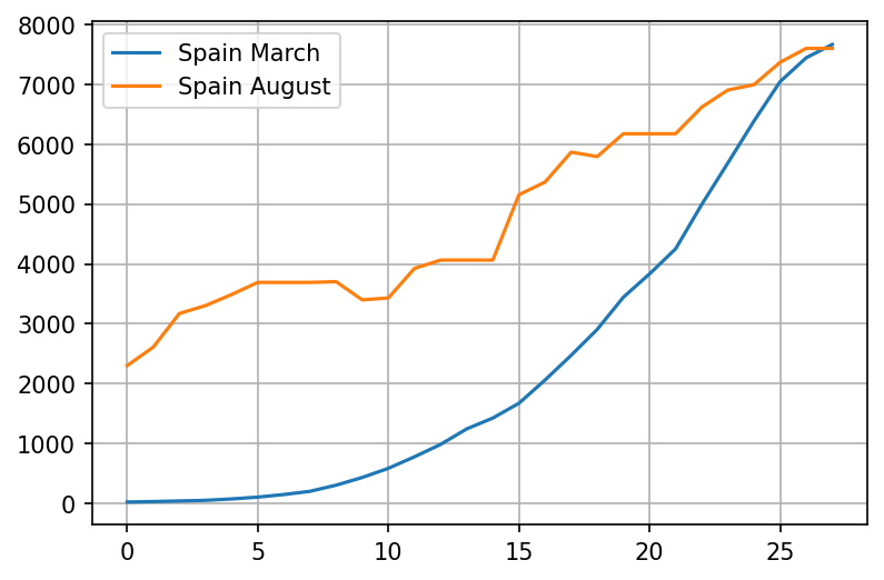
Spain's first wave started at the beginning of March, while the second wave is still ongoing in August. Lets plot those on the same chart:

esp = owid[owid.iso_code.eq("ESP")]

wave1 = esp.loc[(owid['date'] > '03-01-2020') & (owid['date'] <= '03-29-2020')];
wave2 = esp.loc[(owid['date'] > '08-01-2020') & (owid['date'] <= '08-29-2020')];

wave1 = wave1.reset_index().rename(columns={'new_cases_smoothed': 'Spain March'})['Spain March']
wave2 = wave2.reset_index().rename(columns={'new_cases_smoothed': 'Spain August'})['Spain August']
plot = pd.concat([wave1, wave2], axis=1).plot(grid=True)

png

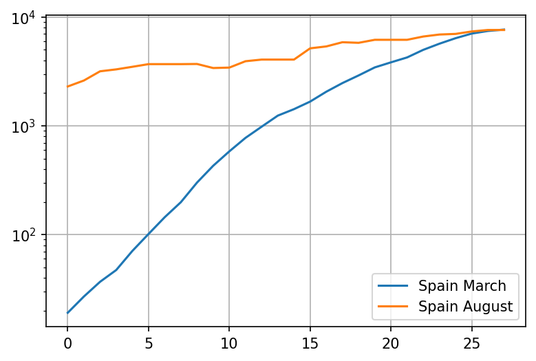
The chart looks very scary, but we can't easily infer the growth rate of the virus by looking at it. Lets try a log plot:

plot = pd.concat([wave1, wave2], axis=1).plot(logy=True, grid=True)

png

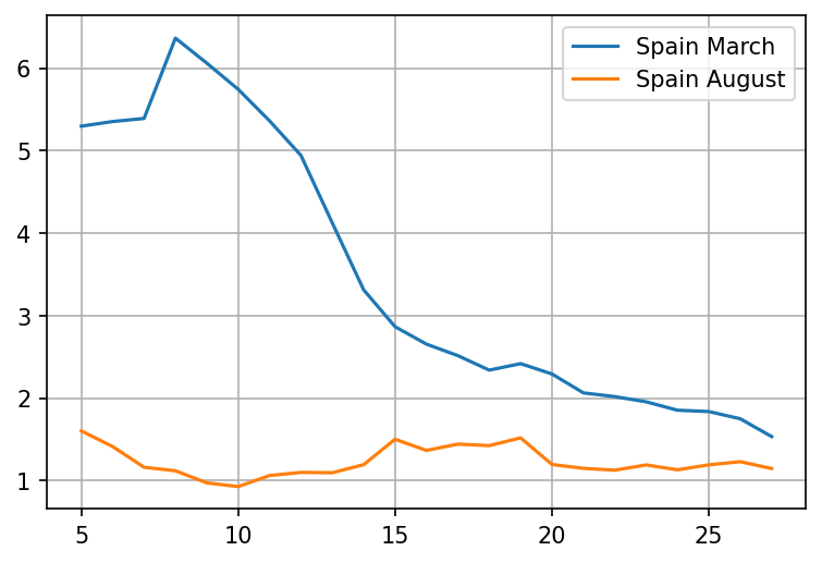
Ok, thats interesting. It appears that despite the case numbers being very high, the growth is significantly slower this time around. Lets try and compare the 5-day rate of growth (which should be pretty close to RtR_t)

wave1growth = wave1.pct_change(periods=5) + 1
wave2growth = wave2.pct_change(periods=5) + 1
plot = pd.concat([wave1growth, wave2growth], axis=1).plot(grid=True)

png

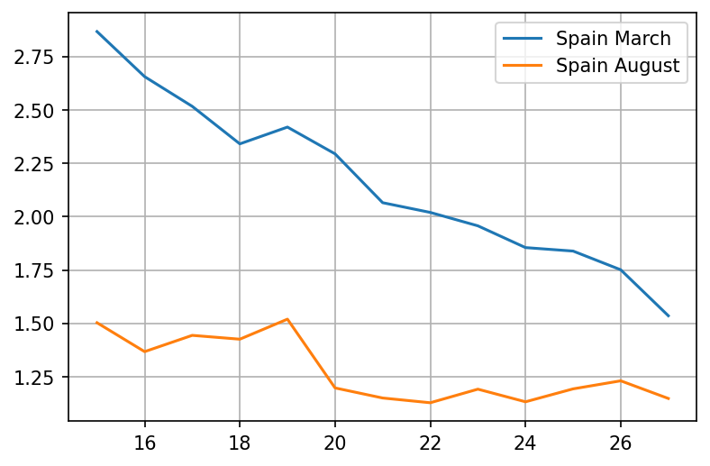
Wow, that is a huge difference. The rate of spread is not even close to the level in March. Lets try zooming in on the period in the middle of the month

wave1growth = wave1.pct_change(periods=5).iloc[15:] + 1
wave2growth = wave2.pct_change(periods=5).iloc[15:] + 1
plot = pd.concat([wave1growth, wave2growth], axis=1).plot(grid=True)

png

It looks like the growth rate barely went close to 1.5 in August, while in March it was well above 2 for the entire month!

But, why is the growth rate so important? I'll try and explain

The growth rate is the most important metric

There are several reasons why the growth rate is so important

Its resistant to errors or CFR changes

Yes, the rate of growth is largely resilient to errors, as long as the nature of those errors doesn't change much over a short period of time!

Lets assume that 5% of the PCR tests are false positives. Lets say the number of daily tests is NtN_t, of which 12% is the percentage of true positives today, while 10% is the number of true positives 5 days ago. In this situation, one third of our tests consist of errors - thats a lot!

Rt=0.05Nt+0.12Nt0.05Nt+0.1Nt=1715R_t = {0.05N_t + 0.12Nt \over 0.05N_t + 0.1Nt} = {17 \over 15}

Without the errors, we would get

Rt=0.12Nt0.1Nt=1210=1815R_t = {0.12Nt \over 0.1Nt} = {12 \over 10} = {18 \over 15}

Pretty close - and whats more, the increase in errors causes under-estimation, not over-estimation! Note that growth means that the error will matter less and less over time unless tests scale up proportionally.

A similar argument can be made for people who have already had the virus, where the PCR detects virus that is no longer viable. We would expect the number of cases to track the number of tests, so the rate of growth would likely be lower, not higher.

Note: the case with asymptomatics is slightly different. We could be uncovering clusters at their tail end. But once testing is at full capacity, the probability is that we would uncover those earlier rather than later, as the number of active cases would be declining at that point.

It can be adjusted for percentage of positive tests

Lets say that the number of tests is changing too quickly. Is this a problem?

Not really. From the rate of growth, we can compensate for the test growth component, easily.

x Cases Tests
Today N2N_2 T2T_2
5d ago N1N_1 T1T_1

The adjusted rate of growth is

Rta=N2T1N1T2R_ta = {N_2 T_1 \over N_1 T_2}

Better picture than absolute numbers

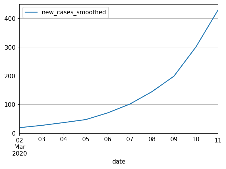
Its best not to look at absolute numbers at all. Hindsight is 20:20, so lets see what the world looked like in Spain from the perspective of March 11th:

esp_march = esp.loc[(owid['date'] > '03-01-2020') & (owid['date'] <= '03-11-2020')];
plot = esp_march.plot(grid=True, x='date', y='new_cases_smoothed')

png

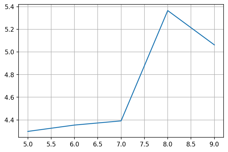
Only 400 cases, nothing to worry about. But if we look at RtR_t instead

esp_march_growth = esp_march.reset_index()['new_cases_smoothed'].pct_change(periods=5)
plot = esp_march_growth.plot(grid = True)

png

The rate of growth is crazy high! We must do something about it!

It encompasses everything else we do or know

Antibody immunity, T-cell immunity, lockdowns and masks. Their common theme is that they all affect or try to affect the rate of growth:

  • If a random half of the population magically became immune tomorrow, the growth rate will probably be halved as well
  • If masks block half of the infections, the growth rate would also be halved.
  • If 20% of the population stays at home, the number of potential interactions goes down to 64% - a one third reduction in the rate of growth (most likely)

Early growth dominates all other factors

With the following few examples lets demonstrate that getting an accurate estimate of the growth rate and its early control is the most important thing and other factors (absolute number of cases, exact CFR etc) are mostly irrelevant

def generate_growth(pairs):
    result = [1]
    num = 1
    for days, growth in pairs:
        while days > 0:
            num = num * growth
            result.append(num)
            days = days - 1

    return result

big_growth = generate_growth([(14, 1.5), (21, 1.05)])
small_growth = generate_growth([(42, 1.2)])

df = pd.DataFrame(list(zip(big_growth, small_growth)), columns=['big_growth', 'small_growth'])

df.plot()

png

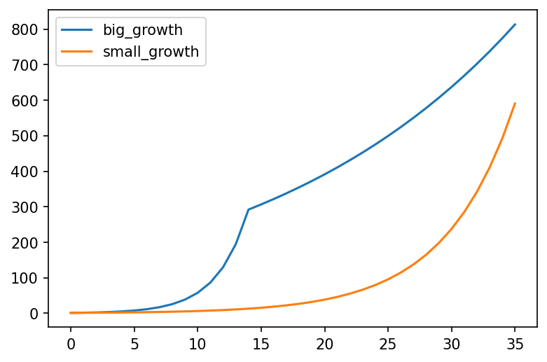
In the above chart, "big growth" represents a country with a big daily growth rate of 50% for only 2 weeks, followed by a much lower growth rate of 5% caused by a stringent set of measures. "small growth" represents a country with a daily growth rate of 20% that never implemented any measures.

This chart makes it clear that growth rate trumps all other factors. If a country's growth rate is small, they can afford not to have any measures for a very long time. If however the growth rate is high, they cannot afford even two weeks of no measures - by that point its already very late.


COVID-19: Can you really compare the UK to Sweden?

Sat Sep 05 2020

When it comes to COVID-19, Sweden seems to be mentioned as a good model to follow quite often by lockdown skeptics. The evidence they give is that despite not locking down, Sweden did comparably well to many other European countries that did lock down - for example, the UK.

Lets see why this comparison is inadequate as the countries were behaving very differently before any lockdown or mass measures were introduced.

This entire blog post is a valid Jupyther notebook. It uses data that is fully available online. You should be able to copy the entire thing and paste it into Jupyther, run it yourself, tweak any parameters you want. It should make it easier to review the work if you wish to do that, or try and twist the data to prove your own point.

Lets load up both countries stats from ourworldindata:

import pandas as pd
import matplotlib.pyplot as plt
from datetime import datetime, timedelta

plt.rcParams['figure.dpi'] = 150
plt.rcParams['figure.figsize'] = [6.0, 4.0]
dateparse = lambda x: datetime.strptime(x, '%Y-%m-%d')
owid_url = 'https://covid.ourworldindata.org/data/owid-covid-data.csv'
owid = pd.read_csv(owid_url, parse_dates=['date'], date_parser=dateparse)

We can get the countries data by their ISO code

codes = ["GBR", "SWE", "ITA", "IRL", "ESP", "FRA"]

Now lets compare deaths. We'll start the comparison when both countries deaths per million go above 0.25 per day to match the percentage of succeptable people. We're using the weekly moving average column from ourworldindata in order to get a better sense of the trend. We're going to take 5 weeks of data

countries = {}

populations = { # in million
    "GBR": 66.0,
    "SWE":  10.0,
    "ITA":  60.0,
    "IRL":  5.0,
    "ESP": 47.0,
    "FRA":67.0
}

for name in codes:
    cntr = owid[(owid.iso_code.eq(name)) & (owid.new_deaths_smoothed / populations[name] > 0.25)]
    reindexed = cntr.reset_index()
    countries[name] = reindexed;

def take(name):
    return countries[name].rename(columns={'new_deaths_smoothed': name})[name]


plot = pd.concat([take('GBR'), take('SWE')], axis = 1).iloc[:35].plot(grid=True, logy=True)

png

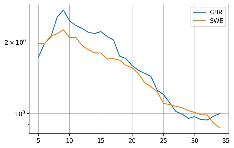
Okay, so it looks like the deaths in the UK were growing a bit faster than the deaths in Sweden from the very beginning! Lets look at the growth rate with period 5 days. This growth rate should be a crude approximation of RtR_t - its based on the fact that people seem to be most infections around 5 days after contracting the virus. To avoid noisiness when the number of deaths is very low, we'll add 121 \over 2 death per million of population. This should cause RtR_t to drop closer to 1 when deaths per million are fairly low:

def growth(name):
    return (take(name) + populations[name]/2).pct_change(periods=5) + 1

plot = pd.concat([growth('GBR'), growth('SWE')], axis = 1).iloc[:35].plot(grid=True, logy=True)

png

It looks like the rate of growth was higher in the UK during a crucial 10 day period before the middle of March, with a growth factor (analog to RtR_t) that is about 30% higher. Now lets try and extrapolate what was going on in terms of cases that produced these deaths.

The mean time from infection to death for patients with fatal outcomes is 21 days. The standard deviation has been estimated to be anywhere between 5 and 7 days. Lets try to keep things simple and stick to 21 days

case_ranges = {}

for name in codes:
    case_ranges[name] = [countries[name].iloc[0]['date']  - timedelta(days=21), countries[name].iloc[0]['date']  + timedelta(days=14)]

print('GBR', case_ranges['GBR'][0], 'to', case_ranges['GBR'][1])
print('SWE', case_ranges['SWE'][0], 'to', case_ranges['SWE'][1])
GBR 2020-02-28 00:00:00 to 2020-04-03 00:00:00
SWE 2020-02-28 00:00:00 to 2020-04-03 00:00:00

This means that the dates where we observe these rates of growth begin on the 1th of March in both UK and in Sweden. Point 5 in the plot is therefore March 5th.

So what happened between March 5th and March 18th in the UK, where the rate of growth seemed to have been between quite high? And what happened in Sweden?

UK: Contact tracing

Contact tracing is a reasonably decent strategy. Assuming you have enough capacity, you should be able to find everyone in contact with the infected person, and also their contacts and so on. It should work reasonably well for most viruses, especially those that have mainly symptomatic spread.

Unfortunately SARS-COV-2 seems to have had an asymptomatic component. The virus quickly entered the community spread phase.

PHE gave up on contact tracing due to being overwhelmed on March 11th. That would be somewhere afterpoint 20. Growth rate still very high, above 2.0. No measures were in place at that time.

After an additional week or two of nothing much, UK finally implemented a lockdown on March 23rd

Sweden: Mass measures

  • Feb 27th: Almega, the largest organization of service companies in Sweden advised employees to stay at home if they visited high risk areas
  • March 3rd: The Scandinavian airline SAS stopped all flights to northern Italy
  • March 11: The government announced that the qualifying day of sickness ('karensdag') will be temporarily abolished in order to ensure that people feeling slightly ill will stay at home from work. This means that the state will pay sick pay allowance from the first day the employee is absent from work

Mobility trends

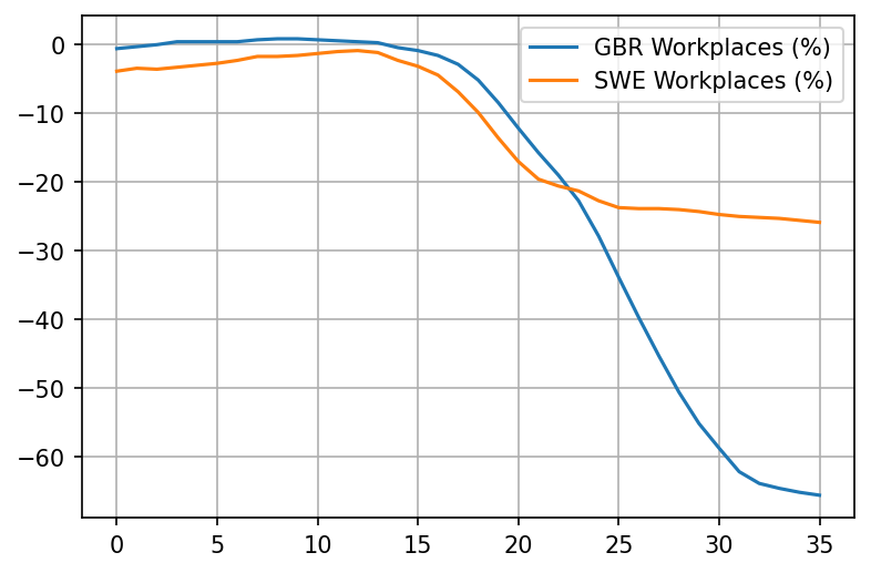
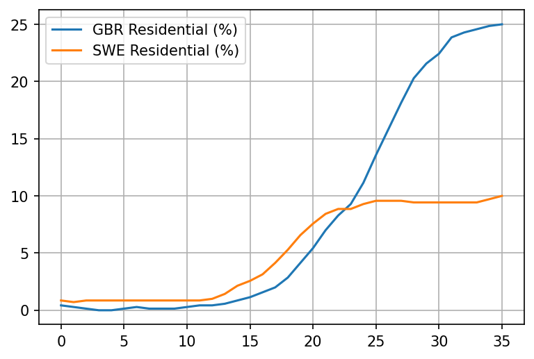
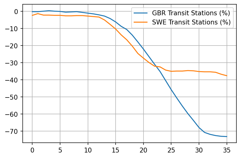
But these are all just decrees. Lets see what really happened by looking at google mobility trends

dateparse = lambda x: datetime.strptime(x, '%b %d, %Y')
mobility = pd.read_csv('https://drive.google.com/u/0/uc?id=1M4GY_K4y6KZtkDtz7i12fhs8LeyUTyaK&export=download', parse_dates=['Date'], date_parser=dateparse)
def extract_mobility(code, name):
    mob = mobility[mobility.Code.eq(code)]
    colname = code + ' ' + name
    mobranged = mob.loc[(mobility['Date'] >= case_ranges[code][0]) & (mobility['Date'] <= case_ranges[code][1])];
    mobnamed = mobranged.reset_index().rename(columns={''+name: colname})[colname]
    return mobnamed

def plot_item(name):
    plt = pd.concat([extract_mobility('GBR', name), extract_mobility('SWE', name)], axis=1).plot(grid=True)
plot_item('Workplaces (%)')
plot_item('Residential (%)')
plot_item('Transit Stations (%)')

png

png

png

Really interesting. Looks like already took matters into their own hands in the UK as much as possible starting March 11th. Things really only take off after March 15th though, with the reduction of workplaces.

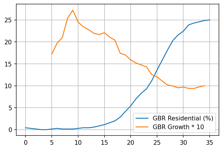
Lets superimpose the two charts for the UK - the "stay at home" chart and the "growth rate" chart:

plt = pd.concat([extract_mobility('GBR', 'Residential (%)'), growth('GBR').rename('GBR Growth * 10').iloc[:35] * 10], axis=1).plot(grid=True)

png

Say what? Staying at home seems to overlap very well with the 21-day adjusted drop of the growth rate in deaths? Who would've thought.

Note that Sweden reacted to the pandemic a day or two days earlier than the UK did but the difference doesn't seem significant - it could largely be an artifact of us trying to align the moment where the virus was equally wide-spread within the population.

Regardless, its still wrong to compare UK with Sweden when the early pre-measures rates of growth are different. To show why, I will use a car analogy

The car analogy

Lets say we have two car models from the same company, World Cars. World cars are a bit quirky, they like to name their cars by countries in the world. We would like to decide which one to buy and one of the factors we're interested in is safety. Specifically, we want to know how well the brakes work.

To determine which car is better, we try to look up at some data on braking tests. We find the following two datapoints for the cars:

Car name Brake distance
UK 32 m
Sweden 30 m

Oh, nice. It looks like the brakes are pretty similar, with Sweden's being slightly better.

But then you notice something odd about these two tests. It looks like they were performed at different initial speeds!

Car name Brake distance Initial speed
UK 32 m 80 km/h
Sweden 30 m 40 km/h

Wait a minute. This comparison makes no sense now! In fact its quite likely that the UK car brakes are way more effective, being able to stop in just 32m from a starting speed of 80 km/h. A little back of the napkin math shows that UK's brake distance for an initial speed of 40 km/h would be just 8 meters:

Car name Brake distance Initial speed
UK 8 m 40 km/h
Sweden 30 m 40 km/h

Now lets look at the rate of growth chart for daily deaths again:

png

Just as we can't compare the effectiveness of brakes by the distance traveled if the initial speed is different, we can't compare the effectiveness of measures by the number of cases per million if the initial rate of growth was different. Different rate of growth means that different brakes are needed.

Note: with cases its probably even worse as exponential (and near-exponential) growth is far more dramatic than the quadratic growth caused by acceleration


Older posts

Machine learning ethics

JavaScript isn't cancer

ES7 async functions - a step in the wrong direction

Why I am switching to promises

Closures are unavoidable in node

Analysis of generators and other async patterns in node

Google Docs on the iPad

Introducing npmsearch

Fixing Hacker News with a reputation system

Let it snow

Why native sucks and HTML5 rocks

Intuitive JavaScript array filtering function pt2

Intuitive JavaScript array filtering function pt1

Amateur - Lasse Gjertsen